Food Cafe — designing a seamless mobile food ordering experience
End-to-end UX for a Canadian food delivery app. The goal was to simplify browsing, customisation and checkout while building a scalable design system for the product team.
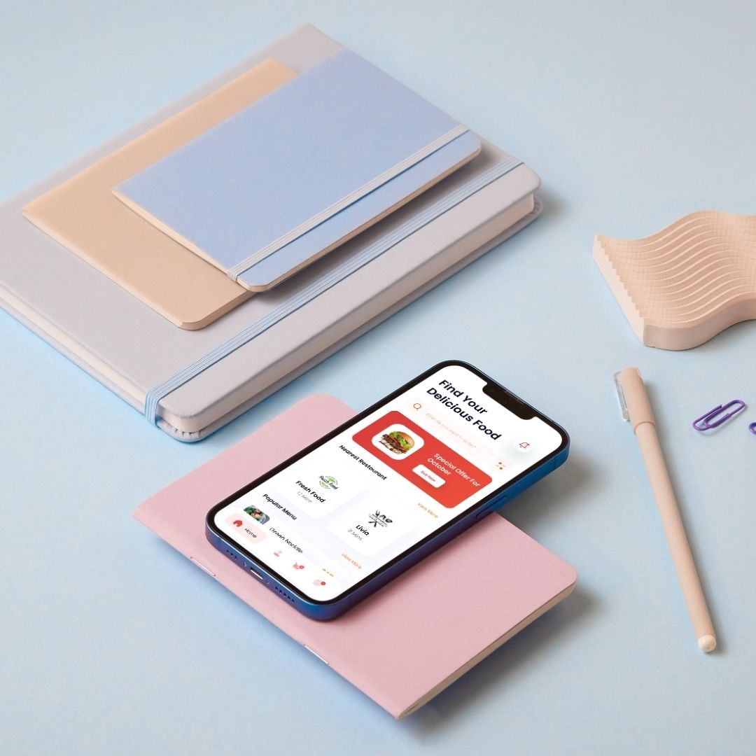
Overview
A seamless ordering experience, built from research up
Food Cafe is a mobile food ordering application designed for a Canadian client in 2024. The objective was to create a seamless ordering experience that allows users to discover restaurants, customise meals and complete orders with minimal effort — while maintaining a clean, engaging interface that reflects the brand's personality.
The project covered the full UX spectrum: from initial discovery and competitor research through to a production-ready design system and high-fidelity UI.
Who it's for
Busy professionals ordering during work hours who need speed above everything else.
Students looking for affordable, quick meals without friction or decision fatigue.
Families placing group orders who need clear customisation and a predictable checkout.
Problem
Ordering should feel quick — but it didn't
Many food delivery apps offer a wide range of features, but the ordering experience often feels overwhelming. Users spent unnecessary time browsing menus, searching for items and completing checkout. These friction points led to frustration and abandoned orders.
Cognitive overload — too many options and competing UI elements slowed every decision.
Excessive customisation steps that broke the ordering flow instead of enhancing it.
An unclear checkout process that eroded trust and caused drop-offs at the payment step.
Research findings
Before moving into design, I reviewed competitor products, analysed existing ordering patterns and interviewed users. The research surfaced five consistent insights that shaped every subsequent decision:
Process
Discovery to high-fidelity in a structured sprint
Competitor audit & user interviews
Reviewed five leading food delivery apps and ran interviews with twelve users across the three target segments to map their mental models and pain points.
Information architecture & user flows
Synthesised research into clear information architecture and user flows for the three core journeys: browse, order and track.
Wireframes → design system → high-fidelity
Lo-fi wireframes validated the structure before building a component-based design system. High-fidelity screens were produced screen by screen in Figma.
Prototype testing & iteration
Interactive prototypes were tested with real users via Maze. Two rounds of iteration refined the checkout flow and the item customisation screen specifically.
My responsibilities
Solution
Five principles guided every screen
Simplified navigation for fast discovery
Menu categories are surfaced immediately with clear visual hierarchy. A persistent search bar and smart category chips let users reach any item in two taps.
Progressive customisation, not a wall of options
Item customisation is broken into logical steps — base choice, extras, special notes — so users make one decision at a time without feeling overwhelmed.
Streamlined cart and one-step checkout
Cart review, payment selection and order confirmation fit on a single scrollable screen. Saved payment methods and addresses remove re-entry friction for returning users.
UI Design
Three core flows — home/discovery, item detail and cart/checkout — designed to work as a seamless sequence rather than three separate screens.
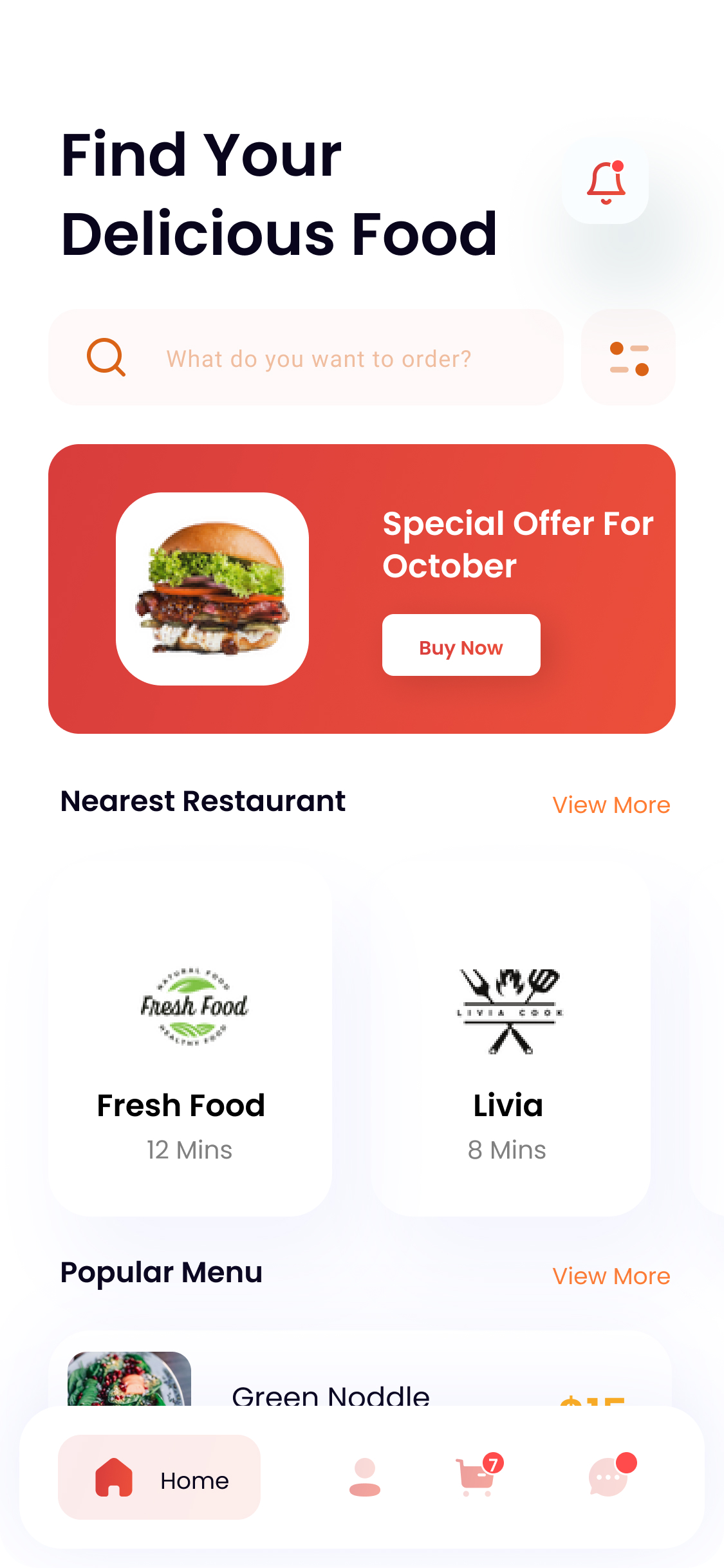
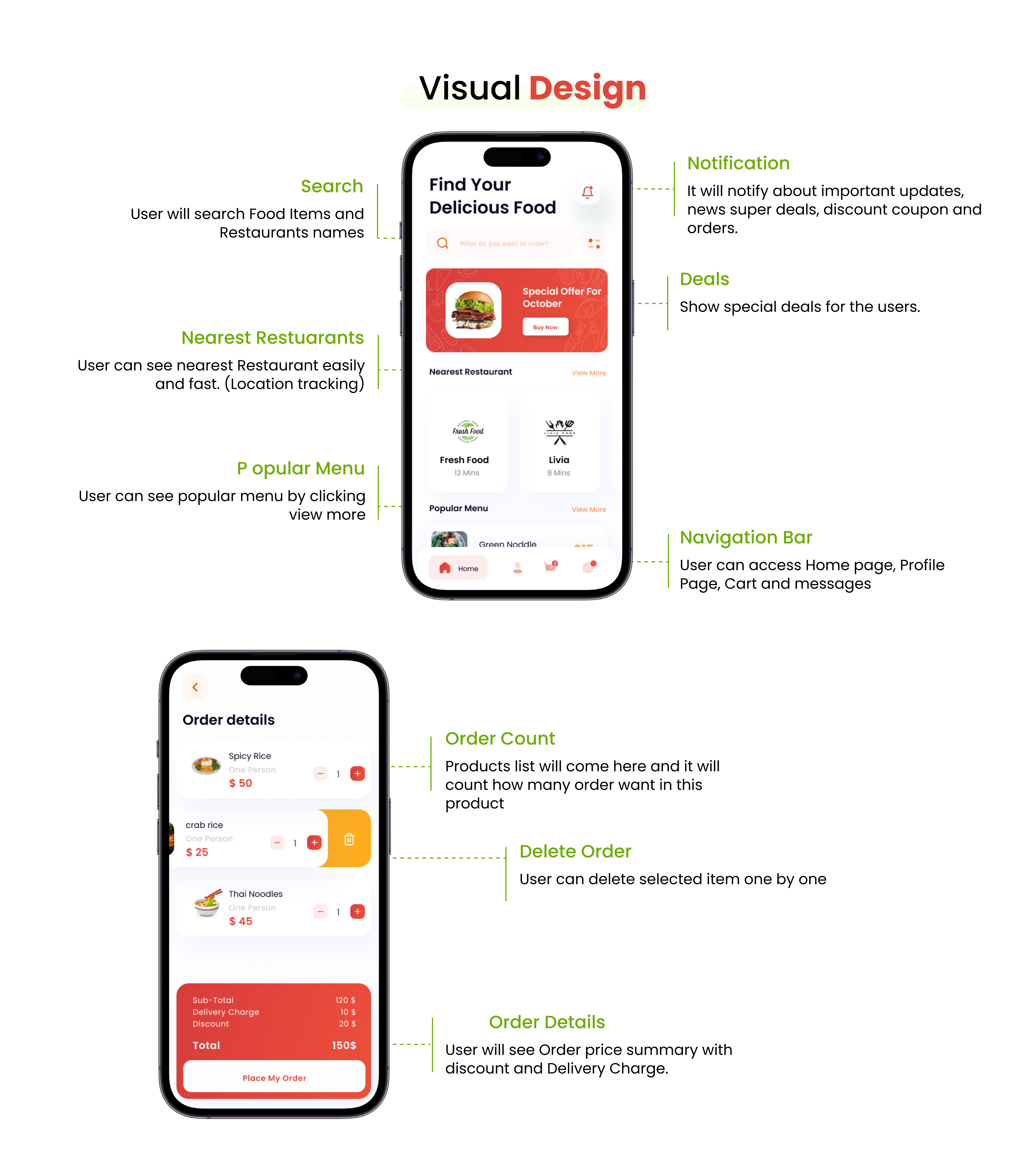
Visual Design
The visual design system brings together colour psychology, typography, spacing and imagery with a clear visual hierarchy. Every interaction was designed to reduce unnecessary decisions and keep the user focused on completing their order.
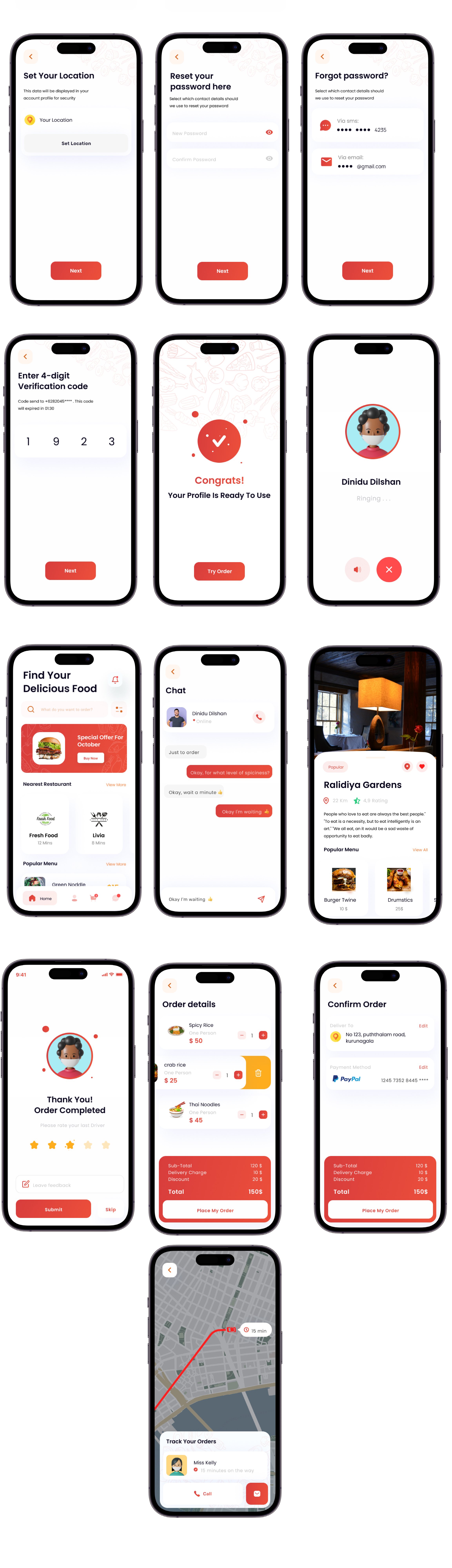
Design System
A scalable, component-based design system ensures every screen stays consistent and future iterations ship faster. Built around reusable tokens covering colour, typography, spacing, elevation and interaction states.
Result
Outcomes & what the work delivered
What the final product delivered
Future improvements
The current solution meets all core project objectives. Several opportunities remain for future iterations as the product grows: